In case you hadn’t heard, we are having a big sale on Saturday at our Cupertino, California store and on WowCool.com all weekend. You will have to make it to Cupertino to dig through the 17 longboxes of comics we are selling at a quarter a pop (or 25 for five dollars, as it says in the headline). I was curious what kind of gems were hidden in those thousands of books. So, I dug through a small section of a couple boxes and pulled out a few that looked interesting to me. This is hardly a representative core sample. There are all manner of books in there. If you are a frequent bargain bin digger you will probably be surprised at the high physical quality of most of the books. You should not be surprised that there are not a whole lot that are A-list titles for both quality and content or popularity. In other words, there are not many Avengers, but plenty of West Coast Avengers and those stacks of Wolfman/Perez New Teen Titans are not a high grade. Hey, it’s a quarter bin. That said, my random-ish sampling revealed some gems, most of which were completely unknown to me. Here’s a few of them.

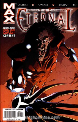
The Eternal #5 by Chuck Austen and Kev Walker, from Marvel’s Max imprint. December, 2003. This very strange take on Jack Kirby’s 1970s Eternals series is a 21-page bloodbath, rendered in Kev Walker and Simon Coleby’s very slick Mike Mignola meets Kevin O’Neill style. Dan Brown’s coloring is worth noting. It is rarely over-rendered, such effects generally being used to fine effect on subtle background details like the cloud and smoke-forms. His pallet is interesting, occasionally reminiscent of Farel Dalrymple’s. There is a sudden shift in hue towards the end of the book that some clever person in the production department chose to place an ad for the old Incredible Hulk TV show DVDs across from. I don’t think this series has been collected in graphic novel form.
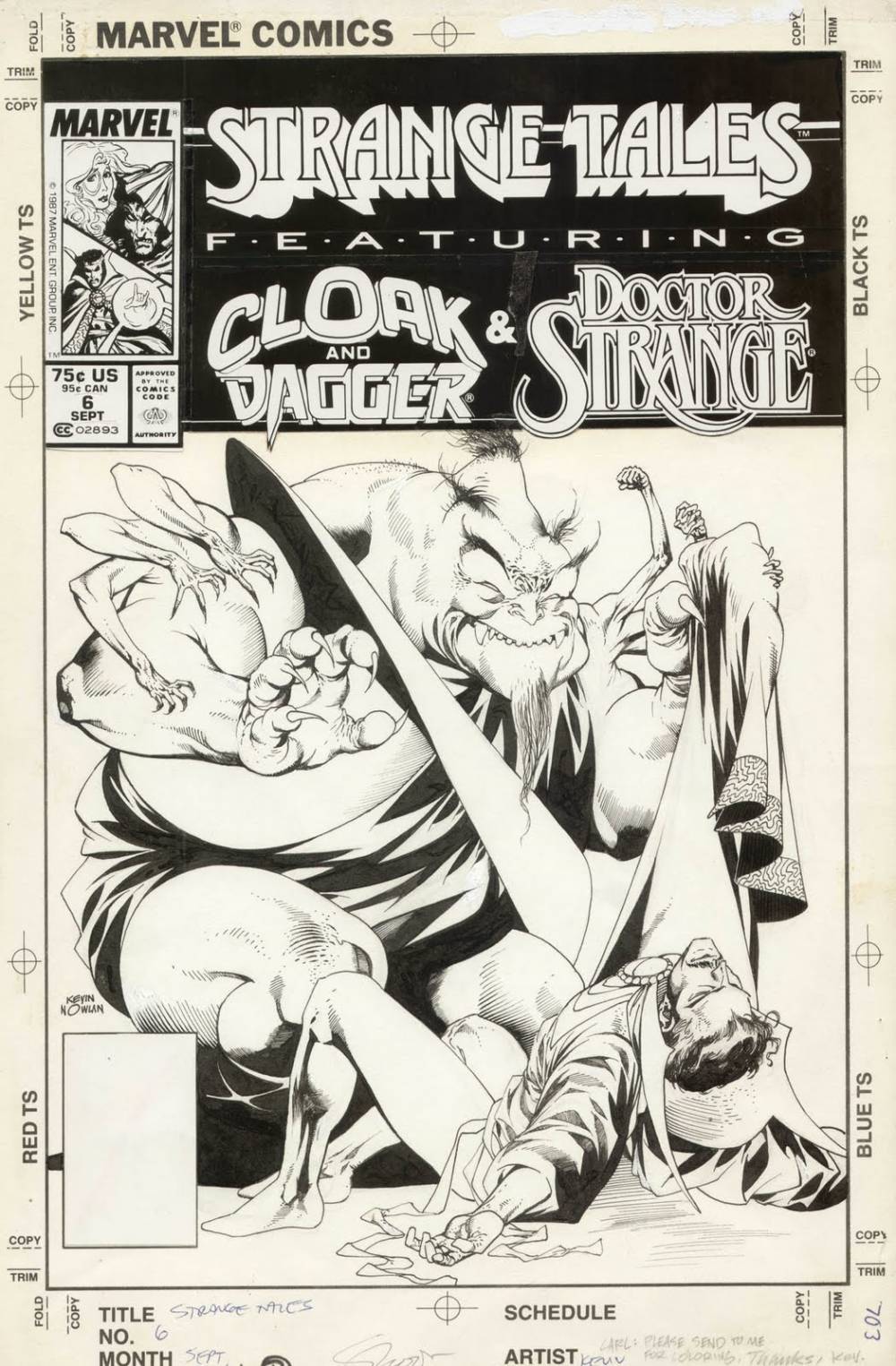
Strange Tales Volume 2, number 6, 7 & 15 — all with Kevin Nowlan covers. Each contains two short short stories starring rotating cover stars Cloak and Dagger (written by their creator Bill Mantlo for the first six issues) and Doctor Strange (all the ones here written by Peter B. Gillis). September 1987 — June 1988. There is much that could be talked about here. First off, these books came out mere months after I’d pretty much stopped buying any Marvel or DC comics. I am only vaguely aware of these and had never really looked at one before. Kevin Nowlan has very generously shared much of his work on his blog, including the pencils and inks (shown above, click to enlarge) for the cover of Strange Tales #6. Back in the early 1980s Peter B. Gillis was a writer to watch. He had done a couple of fill-in issues of Captain America and the last two issues of the original Supervillain Team-Up series that were strikingly unlike anything else at the time. He went on to write Warp, Shatter and Strikeforce: Morituri.
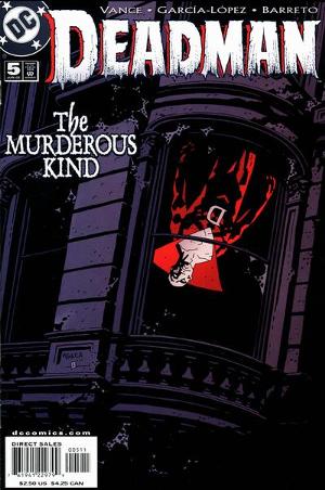
Deadman Volume 3, number 5. Script by Steve Vance. Guest artists José Luis García-López and Josef Rubinstein. Cover art by Mike Mignola. June, 2002. Garcia-Lopez is an artist who has gotten a bit of attention lately. As ‘mainstream’ American superhero comics artists go, he is one of the masters. There are bits of brilliance on display here. It is all, well, what it is… superhero comics… much of it is merely at a very high level of ‘workmanlike’ cartooning, but, there are glimpses of gesture and movement that you will stop and look at. Rubinstein’s hand is surprisingly light compared to his 70s work with artists such as Michael Netzer. Also of note in the comic is a one-page ad for the Kirby-inspired video game Freedom Force. The art on that presumably by creator Robb Waters, not Tom Scioli who would do the comic book version a few years later at Image.
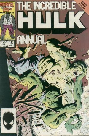
The Incredible Hulk Annual #15. 1986. Cover art by Mike Zeck and Bob McLeod. Interior art by Sal Buscema. Just look at that cover. The Gil Kane-designed Abomination is up against it in this one. That’s some strong art with some crap-ass layout on the titles and what-not. The inside art is pure Sturdy Sal Buscema – pencils and inks. The younger Buscema is well regarded for being a very effective comic book storyteller. His work with Steve Gerber on the Defenders and Steve Englehart on the Avengers is still very affectionately remebered. Sal had drawn many Annual and Giant-sized editions for Marvel, and many such products from Marvel in the 70s and 80s betrayed the hurried nature of their production in the quality of the final product. Sal turns in a sturdy job here. If it was hurried, his line is still always strong and assured, although the ‘backgrounds’ are often very sparse or lacking any detail apart from ‘action lines’. I have to wonder what it would be like if some more time was allowed to be spent on it. There are details of the cover and interior that make me wonder if the artists were pushed to make it ‘more like Frank Miller’. There are a few pages inside that do look suspiciously like Klaus Janson’s inking as well. Hey, this was the Jim Shooter era. All kinds of wacky things were going on.
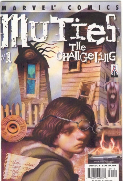
Muties The Changeling #1. April 2002. Writer: Karl Bollers. Layouts: Salgood Sam. Painter: Peter Ferguson. OK. Last up in the roundup is one I have no point of reference for. I seem to find some new-to-me and relatively obscure comic from Marvel every few months that has crazy art that I can’t believe I’ve never heard of. This one is as far away from a typical Marvel comic as you can get. There is a crucial moment in the story towards the back of the book that is largely conveyed through changes in the style of art that is so striking that I don’t want to give anything away by trying to explain it more. This one may be a keeper. The rest will probably go back into the bins for the sale. I hope to see you there… OK, I need to get some sleep.